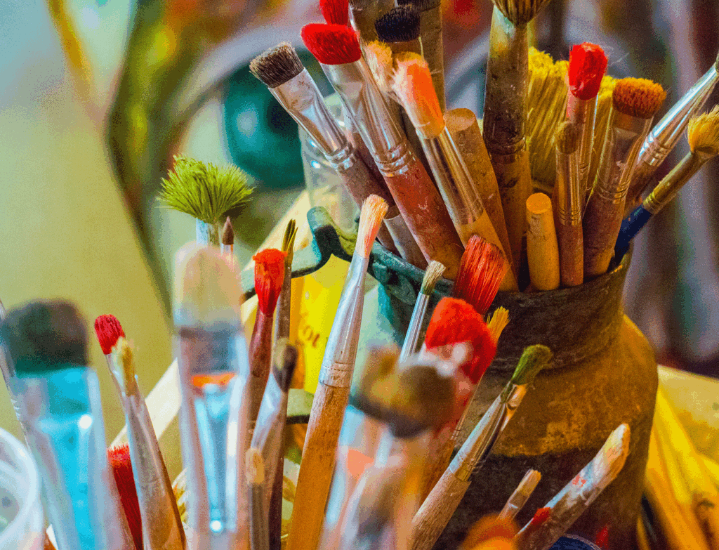


As a visual artist, the core of your creative expression lies in the freedom to bring your vision to life. The vibrant hues, subtle shades, and unexpected color combinations that make up your artwork are a reflection of your unique style and voice. However, in today’s competitive art market, it’s also crucial to consider how your work can resonate with potential buyers. One of the best ways to do this is by paying attention to the latest color palettes in interior design.
By aligning your artistic choices with the trending colors in home decor, you can create pieces that not only speak to your creative spirit but also appeal to the tastes and preferences of modern consumers. In this article, we’ll explore why keeping an eye on interior design trends is a smart move for visual artists, how it can enhance your sales, and how to incorporate these trends without compromising your artistic integrity.
1. Understanding the Connection Between Art and Interior Design
Art and interior design have always shared a close relationship. The colors, textures, and styles that dominate home decor trends influence everything from furniture to wall paint, accessories, and yes, even art. Interior design is not just about arranging furniture; it’s about creating an ambiance, an experience, and a mood. This is where your art comes in. A well-chosen piece of art can complete a room, making it feel cohesive, warm, and inviting.
When people choose art for their homes, they often look for pieces that will harmonize with their existing decor. This is why understanding the latest color palettes can be so beneficial. It allows you to create work that fits seamlessly into a variety of settings, making it easier for homeowners, interior designers, and collectors to envision your artwork in their spaces.
2. Aligning Your Art With Market Trends: A Practical Approach
While it’s important to stay true to your creative vision, being aware of what’s trending in the world of interior design can help you reach a wider audience. If you’ve ever tried to sell your art at a gallery, market, or online, you’ll know that finding the right buyer is all about making a connection. That connection is often sparked by familiarity, and color is a key component of that.
For instance, if warm, earthy tones are trending this season, incorporating shades of terracotta, mustard yellow, or forest green into your work could make your pieces more appealing to those who are redecorating their homes with similar colors. It’s about understanding your audience’s desires and providing them with something that aligns with their aesthetic preferences.
3. Why Paying Attention to Color Trends Boosts Sales
Incorporating popular color palettes doesn’t mean you’re compromising your creativity. Rather, it’s a strategic decision to make your work more marketable. When potential buyers are searching for artwork, they’re often looking for something that will enhance their living spaces. They want pieces that complement their new sofa, the paint color they just chose for their living room walls, or the aesthetic vibe they’re aiming for in their home office. By aligning your art with trending colors, you’re giving buyers one more reason to choose your work.
Here’s how paying attention to color trends can boost your sales:
- Increased Relevance: If your art reflects current design trends, it will feel more modern and relevant to potential buyers. They’ll see your work as fresh, current, and stylish, making it a more appealing choice.
- Broader Appeal: Art that uses popular color schemes is more likely to appeal to a wider range of people, even those who may not have a deep understanding of art. This can be especially true for people who are primarily focused on decorating their homes.
- Better Collaboration Opportunities: Interior designers are always looking for art that will enhance their clients’ spaces. If your work is created using on-trend colors, it’s easier for designers to see how your pieces will fit into their projects, increasing your chances of collaboration.
4. How to Stay Updated on Color Trends in Interior Design
If you’re wondering how to stay in the loop when it comes to color trends, here are a few practical tips:
- Follow Interior Design Publications: Magazines like Garden & Gun, Southern Living, Architectural Digest, Elle Decor, and House Beautiful often feature articles on the latest trends in home decor, including color palettes. Make it a habit to browse through these publications, either in print or online. Also, regional home and design publications where you live can give you an even better understanding of what’s hot in your area.
- Check Out Paint Companies’ Annual Color Reports: Major paint brands like Sherwin-Williams, Pantone, and Benjamin Moore release annual color forecasts that predict the colors that will be popular in the coming year. These reports are gold mines of information for artists looking to understand what shades and hues will be trending.
- Observe Social Media: Platforms like Instagram and Pinterest are great for visual inspiration. Follow interior designers, magazines, builders, home decor brands, and even other artists to see how they’re incorporating popular color schemes into their work.
- Attend Design Shows and Events: If possible, visit design expos or trade shows like Maison & Objet or Salone del Mobile. These events often set the stage for the colors and styles that will dominate the industry in the coming year.
5. Incorporating Trending Colors Without Losing Your Artistic Identity
One of the concerns many artists have is that following trends might dilute their unique style. However, it’s possible to embrace color trends while still maintaining your distinct artistic voice. Think of it not as copying but as adapting. Trends can be a source of inspiration, sparking new ideas and encouraging you to experiment with colors you might not have used before.
Here are a few strategies for integrating trending colors while staying true to your vision:
- Use Trending Colors as Accents: Instead of overhauling your entire color palette, try using trending colors as accents. This way, you’re not completely changing your style but rather adding a touch of modernity that can attract buyers.
- Blend Trends With Your Signature Style: Perhaps your signature style involves abstract landscapes. If jewel tones are trending, you can incorporate emerald greens and sapphire blues into your existing pieces, creating a blend of the new and familiar.
- Stay Authentic: The key is to incorporate trending colors in a way that feels natural to your style. Your audience will be able to tell if you’re forcing it, so make sure that the colors you choose still feel authentic to your artistic identity.
6. The Benefit of Staying Current: More Opportunities for Custom Commissions
Artists who are aware of design trends are often seen as more versatile and adaptable, which can open up more opportunities for custom commissions.
Clients looking for specific color schemes to match their decor might approach you directly if they know you can create pieces that fit their vision. By showing that you’re up to date with the latest trends, you position yourself as an artist who can deliver exactly what the client wants, making you a valuable resource in the interior design process.
7. Examples of Artists Successfully Integrating Color Trends
If you need some inspiration, there are countless examples of artists who have successfully integrated trending colors into their work:
- Abstract Artists: Many abstract painters have embraced the use of trending colors, allowing their pieces to serve as bold statement pieces that complement minimalist, modern interiors.
- Landscape Painters: By using colors that align with popular earthy or natural hues, landscape artists can create pieces that evoke a sense of calm and tranquility, fitting perfectly into home spaces designed to be retreats from the hustle and bustle of everyday life.
- Mixed Media Artists: Artists who work with multiple materials can also incorporate trending colors through textiles, paints, or other elements, creating multi-dimensional pieces that catch the eye and match current interior aesthetics.
8. Why Artists Should Embrace This Approach: Creating More Space and Resources for Creativity
One of the joys of being an artist is having the freedom to create. However, financial stability plays a crucial role in allowing you to keep doing what you love. When your work aligns with market trends, it can lead to more sales. And more sales mean more time, space, and resources to invest back into your craft. As you gain a better understanding of what buyers want, you can create a win-win situation where you’re not only satisfying your need to express yourself but also meeting the desires of your audience.
Creating art that resonates with people on multiple levels—emotionally, aesthetically, and practically—means you’re not just an artist but a creator who understands the power of visual connection.
As a visual artist, your art is a reflection of your inner world, but it’s also a bridge that connects you to others. By paying attention to the latest color palettes in interior design, you can ensure that your work finds its way into more homes, reaching a broader audience. Embracing this approach doesn’t mean sacrificing your creativity; rather, it means strategically choosing colors that enhance your work’s appeal, making it more marketable and desirable.
Ultimately, when your art resonates with the market, it creates a ripple effect—more sales lead to more freedom to create, which in turn leads to more opportunities to explore new ideas and grow as an artist. So the next time you see a new color trend, think of it as a fresh palette of possibilities, waiting to be explored.
Want to grow your art business, creative practice and spiritual life with other artists who are Christians? Consider becoming a part of Created to Thrive – the premier artist mentoring program for Christian visual artists in the world.

Leave a Reply to Carol (Caroline) Slabinski Cancel reply